Food & Hospitality Photography
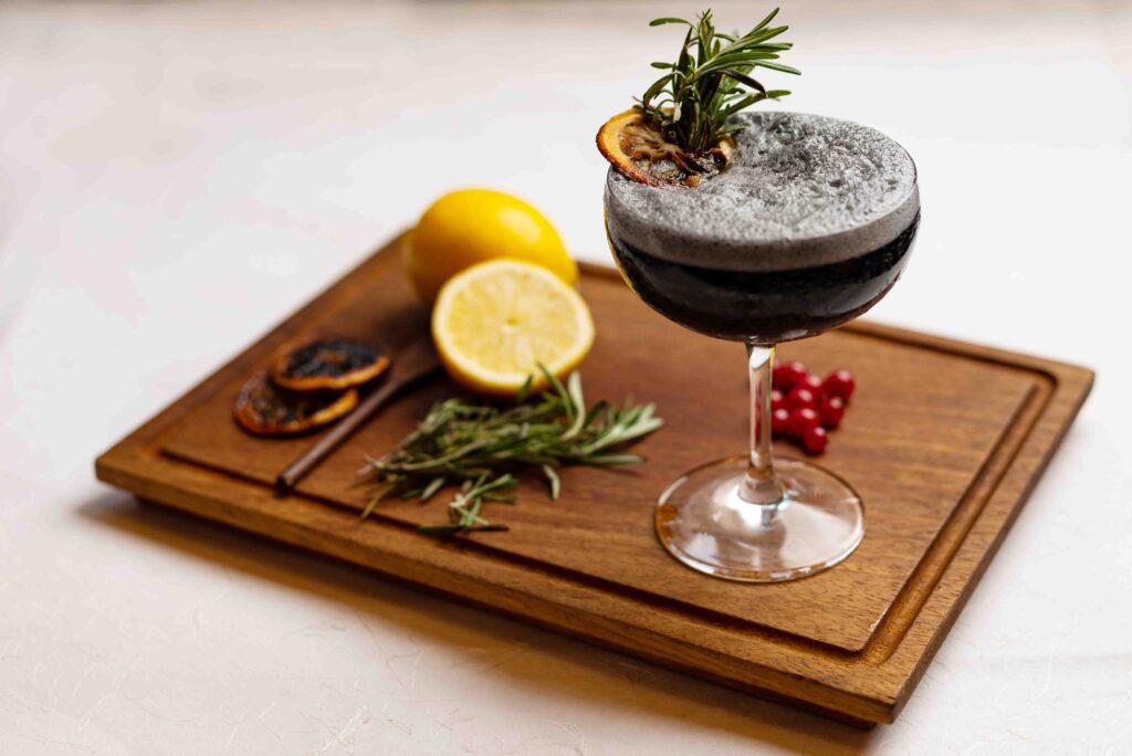
Food & Hospitality Photography February 2, 2026 Translating taste and experience into consistent visual assets Food photography is rarely just about the dish. It’s about timing, environment, volume, and the reality of working inside a live hospitality setup. For this project, the objective was to create a visual library that could support menus, digital platforms, and ongoing marketing, without disrupting day-to-day operations. The visuals needed to feel appetising, honest, and consistent. The challenge Unlike controlled studio shoots, food photography in hospitality settings comes with multiple constraints: Limited preparation and plating time Variations in lighting and space Multiple dishes requiring uniform treatment The need to maintain visual consistency across an entire menu The brand needed images that looked inviting without being overly styled or artificial. Speed and accuracy were just as important as aesthetics. The studio’s approach Led by Mrugank, the studio team approached the project with a strong emphasis on planning. Before the shoot, the team worked with the client to identify priority dishes, define plating standards, and align on how the food should visually represent the brand. Lighting was kept adaptable to suit the space, ensuring dishes looked natural while maintaining consistency across frames. Backgrounds, props, and compositions were chosen to support the food, not compete with it. Clear shot lists and sequencing allowed the team to work efficiently, minimising downtime and reducing stress for the kitchen staff. Execution in a live environment On shoot day, coordination was key. The team worked closely with the kitchen to manage timing, ensuring dishes were photographed at their peak. Mrugank oversaw visual consistency and framing, while the team handled lighting adjustments, plating checks, and quality control. This division of responsibility allowed the shoot to move quickly without compromising standards. Decisions were made in real time to accommodate changes in plating or availability, keeping the workflow flexible but controlled. Designed for daily use The images were created to function across: Menus and delivery platforms Social media and digital campaigns Websites and promotional material Post-production focused on colour accuracy and restraint. The goal was to represent the food as it appears when served, maintaining trust with the customer. The outcome The final result was a cohesive visual library that the brand could rely on across platforms. For the client, this meant: Consistent presentation across menus and marketing Faster content deployment Reduced need for frequent reshoots Takeaway This project reflects the studio’s ability to work within real operational constraints while delivering reliable, brand-aligned visuals. Strong food photography isn’t just about making dishes look good.It’s about building visuals that work, day after day.
Fashion Catalogue & Lookbook Photography

Jewellery Catalogue & Campaign Photography February 2, 2026 Amayra Collection — Nagarkar Jewellers Building a premium visual system for a modern jewellery collection The Amayra Collection required visuals that could work across catalogues, campaigns, and in-store communication. The jewellery was designed to be lightweight and elegant, intended for everyday wear rather than occasion-heavy styling. The imagery needed to reflect that balance while maintaining consistency and credibility. This was less about individual photographs and more about creating a cohesive visual system. The challenge Jewellery photography comes with inherent complexity. Diamonds and polished metals demand precision, and even small inconsistencies can affect how premium a piece feels. The key challenges were: Controlling reflections and sparkle without losing detail Maintaining colour accuracy across skin tones, metals, and stones Creating consistency across multiple layouts and formats Designing images that could accommodate branding and promotional messaging Every image needed to function beyond the frame. The studio’s approach Led by Mrugank, the studio approached this project with clarity before execution. The team worked closely with the brand to define a visual direction that felt refined, contemporary, and wearable. Lighting, backgrounds, and styling were planned to keep the focus on the jewellery while leaving enough visual space for typography and campaign elements. Clear shot structures ensured consistency across the collection while allowing flexibility in usage. On set, Mrugank guided the overall visual intent while the team handled execution, styling coordination, and precision lighting. This collaborative workflow allowed the shoot to move efficiently without compromising control. Designing for real-world use The images were composed with adaptability in mind. Attention was given to posture, framing, and negative space so the visuals could be used across print, digital, and in-store formats without reworking. Rather than relying on heavy post-production, the team prioritised getting the details right during the shoot itself, ensuring accuracy and reducing the need for excessive retouching later. The outcome The final output was a cohesive set of visuals that worked seamlessly across catalogues, promotional creatives, and brand communication. For Nagarkar Jewellers, this meant: A consistent visual identity for the Amayra Collection Greater flexibility in using the images across platforms Reduced dependency on frequent reshoots Takeaway This project reflects how the studio operates: leadership-driven direction, collaborative execution, and visuals designed to perform beyond a single campaign. The strength of the work lies not just in the images, but in the thinking and teamwork behind them.
Jewellery Catalogue & Campaign Photography
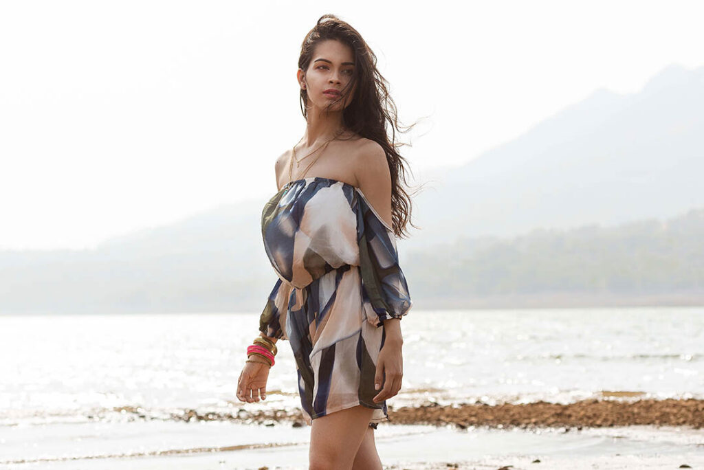
Jewellery Catalogue & Campaign Photography February 2, 2026 Amayra Collection — Nagarkar Jewellers Building a premium visual system for a modern jewellery collection The Amayra Collection required visuals that could work across catalogues, campaigns, and in-store communication. The jewellery was designed to be lightweight and elegant, intended for everyday wear rather than occasion-heavy styling. The imagery needed to reflect that balance while maintaining consistency and credibility. This was less about individual photographs and more about creating a cohesive visual system. The challenge Jewellery photography comes with inherent complexity. Diamonds and polished metals demand precision, and even small inconsistencies can affect how premium a piece feels. The key challenges were: Controlling reflections and sparkle without losing detail Maintaining colour accuracy across skin tones, metals, and stones Creating consistency across multiple layouts and formats Designing images that could accommodate branding and promotional messaging Every image needed to function beyond the frame. The studio’s approach Led by Mrugank, the studio approached this project with clarity before execution. The team worked closely with the brand to define a visual direction that felt refined, contemporary, and wearable. Lighting, backgrounds, and styling were planned to keep the focus on the jewellery while leaving enough visual space for typography and campaign elements. Clear shot structures ensured consistency across the collection while allowing flexibility in usage. On set, Mrugank guided the overall visual intent while the team handled execution, styling coordination, and precision lighting. This collaborative workflow allowed the shoot to move efficiently without compromising control. Designing for real-world use The images were composed with adaptability in mind. Attention was given to posture, framing, and negative space so the visuals could be used across print, digital, and in-store formats without reworking. Rather than relying on heavy post-production, the team prioritised getting the details right during the shoot itself, ensuring accuracy and reducing the need for excessive retouching later. The outcome The final output was a cohesive set of visuals that worked seamlessly across catalogues, promotional creatives, and brand communication. For Nagarkar Jewellers, this meant: A consistent visual identity for the Amayra Collection Greater flexibility in using the images across platforms Reduced dependency on frequent reshoots Takeaway This project reflects how the studio operates: leadership-driven direction, collaborative execution, and visuals designed to perform beyond a single campaign. The strength of the work lies not just in the images, but in the thinking and teamwork behind them.